Posted by Patrick Weiler on 06-07-2003 04:58 PM:
Number 6
Tom,
The design shown in number 6 is similar to one seen in Kurdish
and SW Persian tribal rugs. This would lead me to believe that #6 was woven
closer to those sources, or "Western Khorason".
This bag face uses a similar
design, but not as complex as #6, in the octagonal guls in the corners of the
bag:
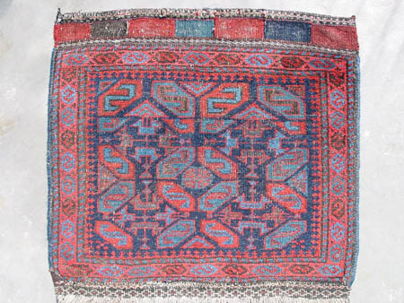
It is
certainly "lighter colored" than typical later Baluch weavings. The design in
the "middle" octagon is a rosette, but this motif alternates with the two headed
animal / trident design in the diagonally adjacent corner guls.
This bag
has a green that perhaps has lost some of its yellow component and looks almost
blue on the front:
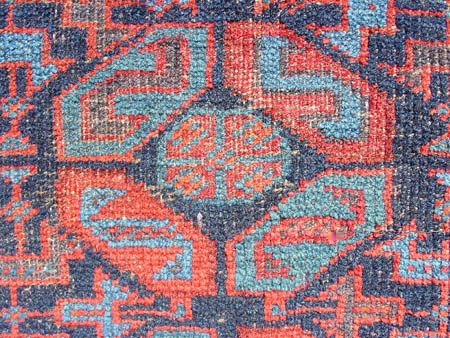
The green can be seen a bit more clearly from the back, as can
the orange-red color in the crosses that are in the corners of the rosette that
is just a bit different than the brick red and the dark red (8 colors in
all):
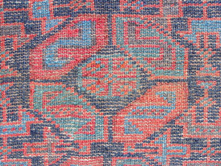
There is
also a light aubergine-purple that is seen in the body of the upper-left "S"
cartouche in the top close up and the upper right "S" cartouche in the bottom
close up.
For some unknown reason, the weaver abruptly halted the field
design 3/4 of the way to the top of the bag and began again as though she were
starting the field over again but shifted by a half gul.
The pile is
woven from the bottom up, so the top of the bag was woven last.
There are 6h
x 8v knots per square inch, asymmetrical open left, no warp depression, two
shots of brown wool weft and white wool warp. The flat weave at the top is
folded over and sewn down with goat-hair thread.
Interestingly, there are a
few symmetric knots in the bag, too.
Patrick Weiler
Posted by Tom Cole on 06-07-2003 08:53 PM:
Both pieces, #6 and your piece are from w. Afghanistan. The border motif,
those S forms in the hexagonal cartouche is a typical W. Afghan Baluch design. A
Khorassan example of this field pattern would tend to be a tighter drawing, more
precisely and tightly drawn... not sure if those are the correct words, but hope
the idea of what I am trying to say comes across. The piece has nice colours, a
good thing.
Posted by Henry Sadovsky on 06-08-2003 12:31 PM:
Old "dark" and young "bright"
Hi Patrick.
Tom wrote: "A Khorassan (of course, by this Tom means
Iranian Khorassan) example of this field pattern would tend to be a tighter
drawing, more precisely and tightly drawn... " I would add also, that it would
be darker.
Thus, your statement-
quote:
"It is certainly "lighter colored" than typical later Baluch weavings.
loses its meaning. That is to say, there are 'Baluch' weavings
which are much darker than your bagface and which are older than it. Such
weavings simply come from a different area (perhaps) and different weaving group
(no doubt) than your's. Additionally, many (perhaps, even most) brightly colored
"baluchs" are late. For example, I think piece #3 in Tom's Salon is probably
quite young.
Descriptors such as "dark", "bright", "light" or "gay",
when refering to the palette of a 'Baluch' weaving, does not, in itself, allow
any judgement as to the age of said weaving.
As an aside, it is quite
interesting to compare your bagface with a similar one on page 78 of Diehr's
book, "Treasured Baluch Pieces". Just how similar are they? Which is older?
Posted by Patrick Weiler on 06-09-2003 07:33 PM:
Henry,
I do not have the Diehr book. Could you post a copy of that
piece?
Does he give a provenance for his piece?
As for the "lighter"
colors, this piece does have a lot of what I would call "light blue" in it. This
light blue tends to give the overall weaving a lighter overall tonality than
weavings of similar design without the light blue.
As Tom has said, and I
think you are indicating also, the colors used can be more useful in determining
where the piece was woven than how old it necessarily is.
I think that a lot
of weavings from specific areas have quite similar colors for a number of
reasons, including the content of the water used - which can be markedly
different from one locale to another, the "traditions" of dyeing - such as local
recipes that may be unique to an area, and the possibility or likelihood of
professional dyers providing their services to the majority of weavers in any
given area. This last item may also relate to the abundance of Baluch prayer
rugs. I suspect that many, if not most, were made for sale rather than for
personal use - even the older ones - because of suggestions that the Baluch were
not necessarily followers of the Moslem traditions which utilized prayer rugs.
Just as many agrarian cultures manufacture crafts to supplement their gardens
and animals, so too would the Baluch most likely have done.
Speculatively
yours,
Patrick Weiler
Posted by Henry Sadovsky on 06-10-2003 01:05 AM:
Hi Patrick.
I don't have access to a scanner right now and will not
be able to scan in the photo for the next few days as I will be out of town. If
no one does so beforehand, I will get the photo up when I return to
town.
Henry
Posted by Igo Licht on 06-11-2003 11:21 PM:
Baluch bag Photo
Here is the photo of the bag shown also in Fran Diehr book (plate
78)
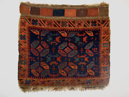
Igo
Posted by Patrick Weiler on 06-12-2003 10:17 AM:
To Be the Same, or Not To Be the Same?
Igo,
Thank you for posting the picture.
The basic design is
certainly the same.
The colors in the Diehr piece tend towards the warmer
orange-red rather than the cooler blue-reds in my piece. In my experience,
weavings with the orange-red wool also have a different feel - a "thicker" and
softer wool compared to the "thinner", harder feel of the blue-red weavings.
Perhaps this indicates a different weaving area.
In the Diehr piece, the
design seems to start from the lower left, and as the weaver could not complete
an entire design segment, this left the right side of the bag with about an inch
of open space which she filled with small "s" motifs. At the top, she had almost
enough room for a half-gul, but not quite enough room for half of the rosette
that is in the middle of the guls. Note that the rosette is more geometric and
stepped than in the single rosette gul in my piece.
Alternately, the design
starts in the middle at the bottom of my piece, leaving the top of the field
requiring some kind of resolution instead of at the right side of the field with
the Diehr piece. In this case, the weaver started a new row of slanted "S"
cartouches at the top, cutting off the field design in mid-motif rather than
leave a gap to fill. This resolution does give the field a "framed" look, with
corresponding slant-"S" cartouches in each corner, but leaves the abrupt break
in the design across the field near the top.
Why does this field design
tend to be woven to not "fit" properly within the confines of the field? If
these were Turkmen bags, the design would be similar to a six or nine gul bag -
with all of the "spaciousness" and discrete design elements that make the best
Turkmen bags so successful.
Were the weavers purposely attempting to make an
unbalanced design?
Patrick Weiler
Posted by Vincent Keers on 06-12-2003 08:02 PM:
Hi Patrick,
This design is perfect.
Like life is perfect.
Like
this world is perfect.
Like this sopting is ferpect.
Isn't there this
story that says that the design is only given to you for only a short periode of
time? It passes you by, like a ship on a river, like the stars in the
sky?
Well, I gave it a try.
Best regards,
Vincent.
Posted by Patrick Weiler on 06-12-2003 08:41 PM:
One Fine Design
Vincent,
At least you tried. I think you meant to say "Like a ship in
the sky, like the stars in the river."
I looked at a half dozen books and
found Baluch rugs and bags with this design. Not in even one of those weavings
could this design be said to be accurately proportional all the way around. Even
in the rug in plate 45 in Boucher, said to be Qainat area of Persian Khorasan,
the design starts out fitfully. Brian MacDonald shows a bag, #186, of the
Taimuri of western Afghanistan, that comes close, but the rosette guls in the
middle end up being a column of flowers, not guls at all. He also shows a
balisht in plate 183 that starts out well, but the design falls apart towards
the top, almost becoming a "prayer rug" design. Opie's Tribal Rugs shows #13.20
that comes close, but the top gul peters out 2/3 of the way up. Anne Halley
shows a rug in plate 98a of Rugs from Pacific Collections (Firdaus area) that
also has only half of the top row of guls. An exemplary attempt is made in a
Compartment Design bag of Mark Hopkins (Northeast Iran) from plate 311 in
Atlantic Collections, but there is just too much room left at the top of the
field to hold a fourth complete row of guls. The weaver just put in a row of
compartments with the diagonal "S" motif instead. Hopkins' Plate 317 from
Atlantic Collections (NE Iran/NW Afghanistan) gets around the problem by just
putting 10 floating guls in the middle of a plain field sofreh. No attempt was
made to integrate the "minor guls" into the pattern.
So, either all of
these weavers purposely confounded the design, or maybe it is too difficult a
design to accurately render.
These weavings with this design seem to come
from many different areas, too. How did ALL the weavers know to mess this design
up?
Curiously,

Patrick Weiler